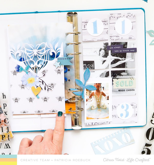
Patricia created these stunning pages for some of her daughters Ballet photos. One layout has a grid design with a cut apart photo and music sheets. The other side has a detailed die cut with a flap that hides an additional photo. I love the white and blue color, it gives such a soft and elegant look!
Visit the Roebuck Adventures blog for more info.
-Heather
Leave a Reply