I am coming back to my first love in scrapbooking . The wonderful world of pens, papers, scissors, glues, tapes, stamps, and the list just keeps going. I thought to myself, “I have been focusing on the digital side of things for quite some time. It is time to have a little fun and get a little messy. Okay, maybe I do not have to get messy, but use my hands a little.”
I receive an interesting email the other day that got me thinking about what it really takes to make a great layout. And I guess, now that I am thinking about, this applies to both traditional and digital scrapbooking. I thought that maybe for the next few posts I would focus on these things.
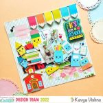
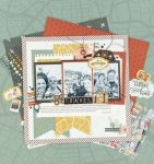
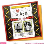
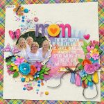
Today’s focus is going to be color. The colors of your layout are so important. How they compliment your picture (most important), how they compliment each other, and how they generally just making your layout appeal to the person viewing it, all of these things are important.
I went looking for some more information that will guide us in this area. I know I have definitely been challenged in this area at times. I will go to the store, pick up the papers, and will think to myself “this looks beautiful and I know it will compliment my picture.” Then when I get home, I think “this is definitely not beautiful and it does not fit with my picture.” I do not know how many times I have done this to myself. Enough times that I have a very healthy supply of extra paper.
I found some articles that I think will help all of us. And like I said, this does not just apply to actually paper, but digital papers you will be using also.
Check out these articles and then let me know if they have helped.
One Scrappy Site!: Color Basics
PixelPaintPapers: Review on ColorCache
everyday digital scrapbooking
ScrapJazz


Leave a Reply