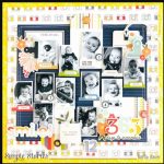
Designer Digitals has a color challenge this month to use only shades of grey. Grey is actually one of my favorite colors, I love the subtle tones and how it works so well with lots of other colors or all on it’s own. The grey shades in this digital Baby Tooth page add a soft background and bring focus to the photo.
Visit the Designer Digitals Details blog for more info.
-Heather


What a truly Beautiful layout, the greys are Beautiful. … ???