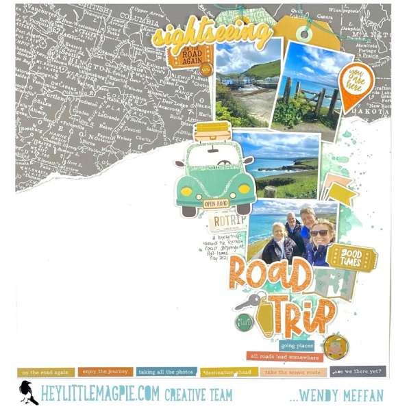
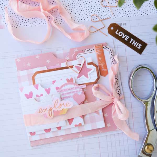
Wendy used products from Simple Stories to create this fun Road Trip Travel Layout. Across the top she’s created a border of torn pattern paper that looks like a map and a thin border across the bottom of word blocks. … Read More ...
FREE Summer Sundress Die Cut Files
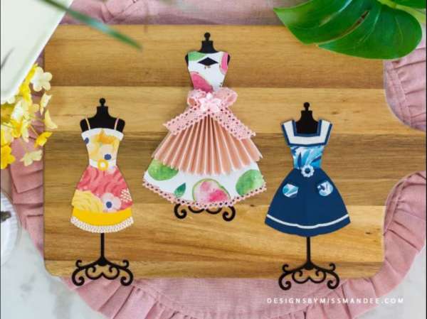
These lovely Summer Sun Dress Dies from Miss Mandee are perfect for adding to scrapbook pages with girls all dressed up for summer, invitations to luncheons, planner pages, book marks and more. These FREE die cut files work with your … Read More ...
How to Create a Flip Out Flap Layout
Kim has a fun way to add some interactive flair to your next layout by creating your our Flip Out Page. The man section is a large 8″ x 8″ photo with a title and some small sections for journaling … Read More ...
TV Watch List Journaling Page
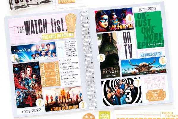
I’m a big fan of watching TV and Movies, sometimes I think I should keep a list like I do with the books I read so I can keep track of what I have and haven’t yet watched or what … Read More ...
Summer Memories Butterfly Layout
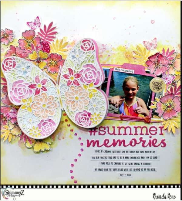
Wow, check out all the texture and depth on this amazing Summer Memories layout from Rhonda! She used Shimmerz Paints over gesso to create a mixed media painted background but the main star of this design is the large butterfly … Read More ...
Summer Pool Traveler’s Notebook Pages
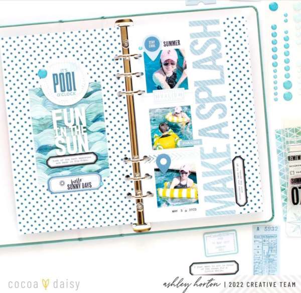
These wonderful Pool themed Traveler’s Notebook pages from Ashley feature the new Wayfarer line from Cocoa Daisy. These tall designs feature a sentiments page that features stickers, labels and stamps stacked down the center over polka dot and wave pattern … Read More ...
Tropical Wreath Layout
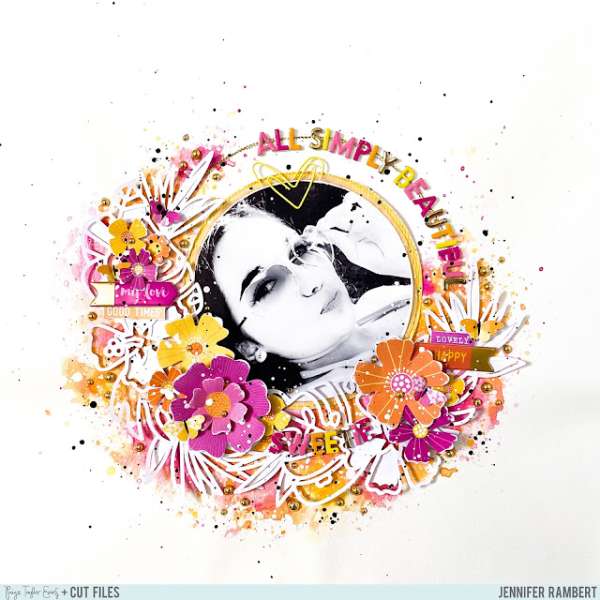
Jennifer created an amazing design in pinks, oranges and yellows for this Tropical Wreath Layout. She used a bough of tropical leaves and flowers die cut from white cardstock to form part of the wreath. With it she mixed lots … Read More ...
Travel Album on a Clipboard
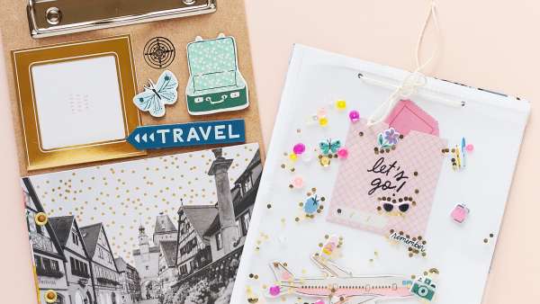
Sandra has a very clever way to “bind” and hold an album, she used a clipboard! For this Travel Themed Mini Album project she decorated the base of the clipboard with embellishments and a photo then created an album that … Read More ...
Create Stenciled Doodles for a Layout
Kim created the pretty flowers on the sweet Dog Layout with a stencil and pens. First she used a flower stencil to apply gesso and after it dried used pens to outline and fill in with doodling. This page also … Read More ...
Summer Slides Grid Layout
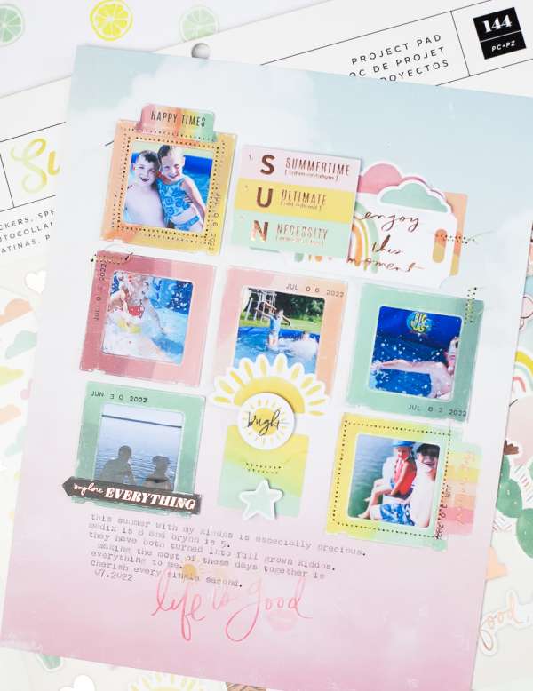
A grid style layout is always a quick and easy way to put together a design but it doesn’t have to be plain and simple. This wonderful Summer Page from Heidi Swapp uses small frames around the pictures to give … Read More ...
How To Make Nested Pockets Mini Album
Just when you think you’ve seen every style of mini album some inventive creator comes up with a new design. Jamie used nesting pocket dies to created a fabulous Nesting Pockets Mini Album. It has progressively larger pockets as you … Read More ...
Rainbow and Flaps Layout
I love the contrast of the bright rainbow and the more subtle flaps on this double page design from Kerstin. On the right she used rainbow striped paper adding a row of stacked embellishments down the center, notice how the … Read More ...
Puppy Love Stamped Layout
Andrea used stamps and dies from Reverse Confetti to create this sweet Puppy Love Layout. She added watercolor splashes and splatters onto her background paper, matted the photo 3 times using different pattern papers and used colorful ink pads to … Read More ...
Memory Planner Pages Through the Year
Jessica used a large weekly disc bound planner from Happy Planner as the base for her Memory Planner. This large format gave her lots of room to add small photos and tons of journaling throughout her pages and the discs … Read More ...
How to Add Stitching to a Layout with No Sewing Machine
Sewing and stitching has been popular on paper crafts for awhile now, you can use a sewing machine or dies that punch holes but what if you don’t have those? Well, Lisa Dickinson has a solution for you. She first … Read More ...
