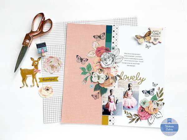
Victoria used an asymmetrical style for this beautiful layout. Offsetting the “center” line down the page along with color on one side and white on the other adds so much interest to the design. This offset is balanced out with larger embellishments and photos on the lower right hand side of the page with clusters of more accents in the upper left side.
Visit the American Crafts blog for a closer look.
-Heather




Leave a Reply