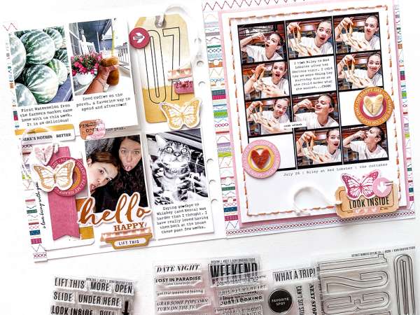
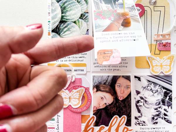
Jessica has a terrific way to add more space and an interactive element to layouts with hidden flaps. On her left page she created smaller flaps under the photos, on the right page most of the entire page lifts up making lots more room for photos and journaling. Kerri Bradford loved the idea so much she created a new stamp set to prompt others to “look inside”, lift up” or “open”.
Visit Kerri’s blog for more info.
-Heather
Looking for scrapbooking supplies? We suggest Lifescrafts.com

Leave a Reply