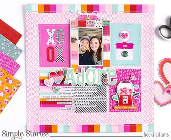
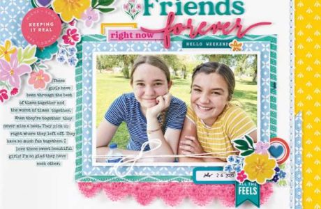
This sweet layout uses a grid of pattern paper rectangles to create the background, adding a photo, strips of journaling and embellishments over top. Visit the Simple Stories blog for more info.
If you’re stuck for a scrapbook layout design idea try going back to the basics with a grid design. Rows of squares or blocks can create quick and easy designs that also hold a lot of photos. But the grid doesn’t have to be for the photos you can create a background using a grid pattern or you can mix it up and use circles instead of squares and they don’t need to be in neat rows either you can stagger and stack them as well.
I’ve collected some fun and unique grid and block style page ideas to get your creative juices flowing for your next scrapbook layout. Below each photo you’ll find a link that will have more information about how they were made, companies products used, etc.
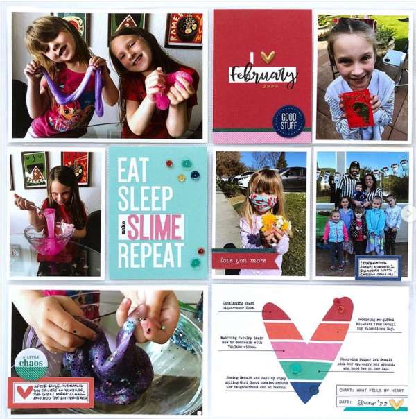
Photo pocket pages already create a grid for you, simply slip in some photos and journaling cards with fun embellishments added too. I spotted this layout over on the Elle’s Studio Instagram.
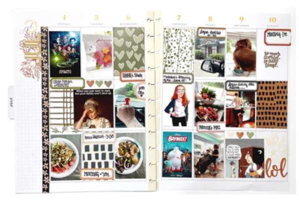
Since calendars and planners are usually already laid out in a grid it’s a great way to create a memory planner like these pages from Sara. Add a photo and simple journaling to each date for quick and easy scrapbooking. Visit the Wild Whisper Designs blog for more details.
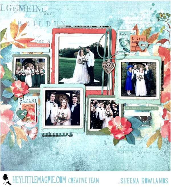
Even though these photos aren’t in straight lines I still consider this a grid. The layered and off set stacked photos add extra interest to the design but create lots of room for many photos. Learn more about this pretty wedding layout on the Hey Little Magpie blog.
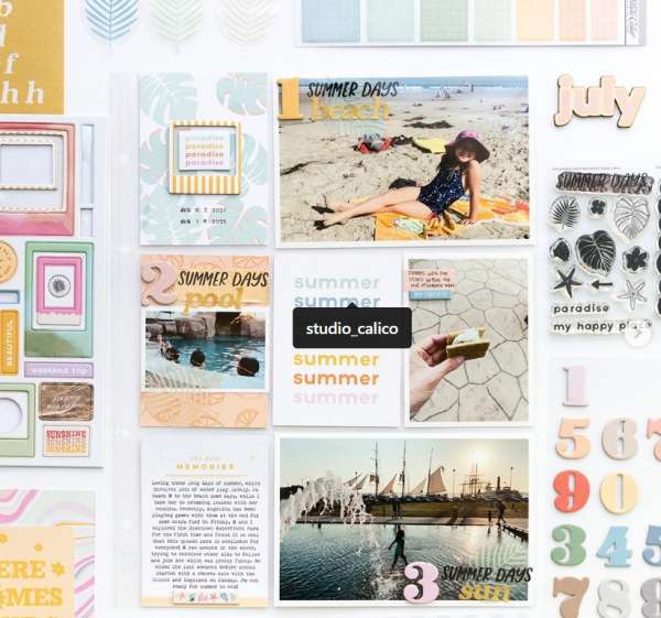
Here’s another pocket page design, this time for summer vacation days. I love the large numbers for each day on each photo with simple “titles” on each pic, there’s also a places for journaling, dates and embellishments. I saw this layout on the Circle Plus Arrow Instagram.
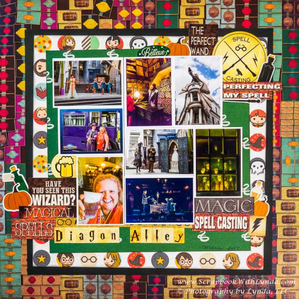
This colorful layout features the Wizarding World of Harry Potter, with blocks of all the photos clustered into the center with lots of layers of different pattern papers behind. Leaving thin white borders around each photos helps them not get too muddled. Visit the Scrapbook with Lynda blog for more on this page. And be sure to check out my recent round up of Harry Potter layout ideas if you’re a fan.
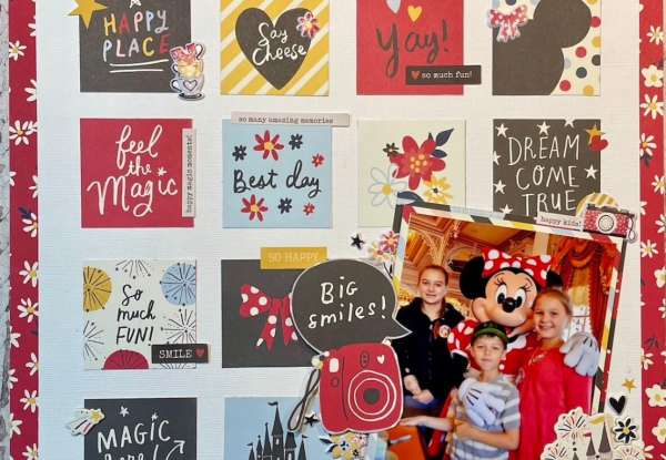
Rows of squares of pattern papers form a fun and festive backdrop on this Disney page. The large photo has clusters of embellishments around it to draw the eye to the picture. Take a closer look over at Scrapbooking Bee blog.
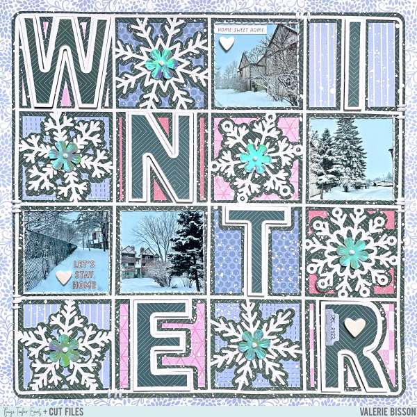
Check out the way the letters spell “winter” across and down this pretty page. Each grid block has a letter or photo or snowflake in pinks and blues for a very cohesive design. Visit the Paige Taylor Evans blog for all the details.
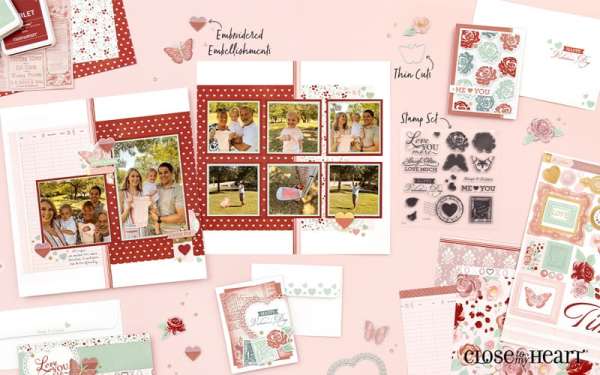
A great way to create a double page spread is using a grid on one side and then adding two large photos on the other, you have room for lots of photos but can pull the interest on the larger more important images and then there’s also room for journaling on the 2nd page as well. Visit the Scrapbook and Cards Today blog for a closer look.
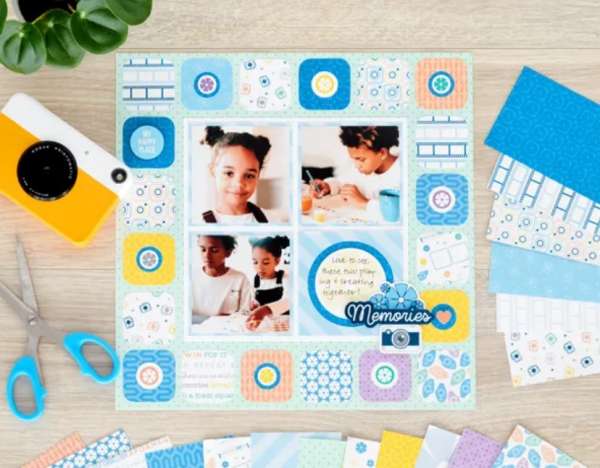
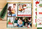
This adorable design sort of has two grids, the one in the center with the 3 photos and journaling and then the outer “border” of squares, it’s a 2 for 1 grid design! Hop over to the Creative Memories blog for instructions.
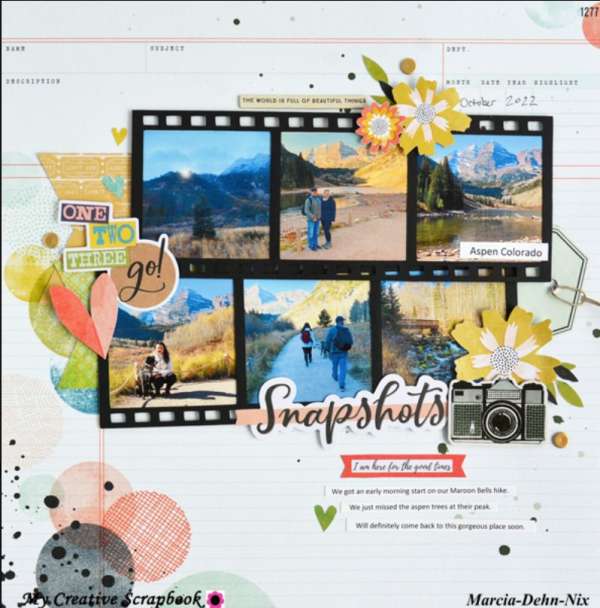
You can find a free sketch at the My Creative Scrapbook blog that features a grid made up of two strips of 3 blocks, their design team is sharing 4 different layouts based on the sketch. 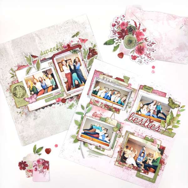
Here’s another example of a two page layout with 4 photos and 2 photos, these have lots of layers behind each pic for wonderful texture and dimension. Take a closer peek at The Cherry on Top blog.
I hope these grid ideas have inspired you to try them for yourself on your next scrapbook layout.
-Heather
Looking for scrapbook supplies, we recommend A Cherry on Top.com
Love these ideas! Thanks so much for the inspiration. So many ideas here. Thanks again!