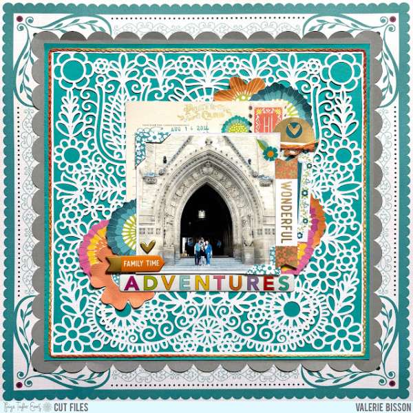
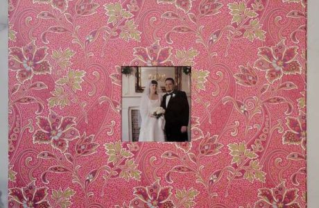
This layout has layers of very detailed backgrounds that mimics the detailed architecture in the photo. Valerie also tucked in lots of florals and sentiment strips around the photo too. Learn more at the Paige Taylor Evans blog.
With the weather getting warmer and kids being out of school for Spring break you might be heading out to do some traveling. If it’s a short trip to a nearby place or your hoping on a plane and heading to a far away destination be sure to take lots of pictures of your travels and adventures to scrapbook when you return home. Today let’s take a look at some ideas to inspire those fun getaway pages.
Below each photo you’ll see a link, click to learn more like products used, techniques and tips.
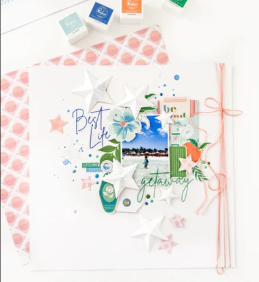
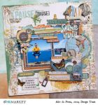
This tropical getaway layout uses a beautiful blue and peach color palette. Susi added a beach photo in the center surrounded by 3D stars, flat stars, acetate words, tags, florals, twine and gems for a design with lots of dimension and interest. Learn more at the Pinkfresh Studio blog.
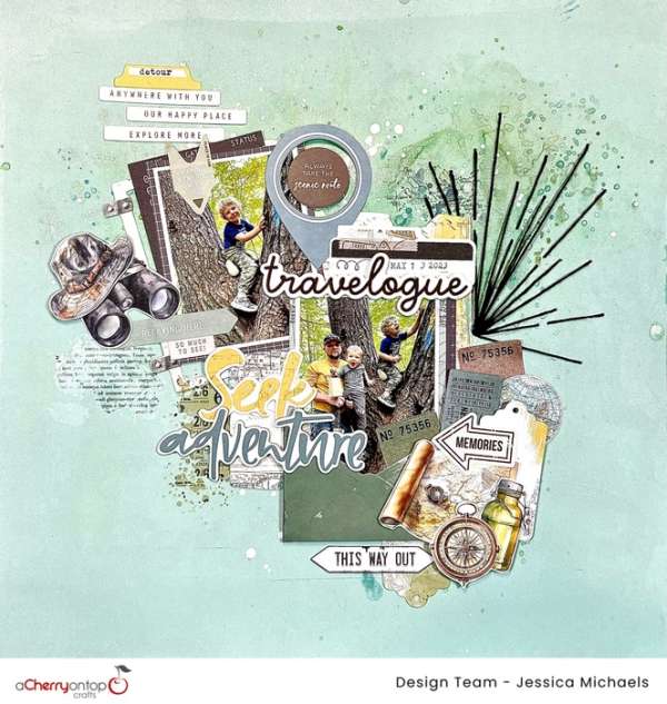
This layout captures all the fun of a dad and his boys out on an adventure. This mixed media design has gesso and paint splatter, rub-ons, a stitched sun burst, chipboard elements, lots of sentiments and ephemera. You can watch Jessica’s process video on The Cherry on Top blog.
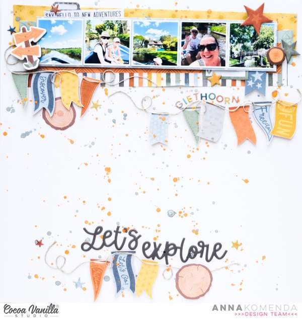
Anna printed 5 smaller photos from her trip adding them in a row across the top of this fun layout. Beneath the photos she added layers of pattern papers and created two banner borders from fussy cut flags and twine. A splatters fills in some of the white space on the background of this design. Visit the Cocoa Vanilla blog for more details.
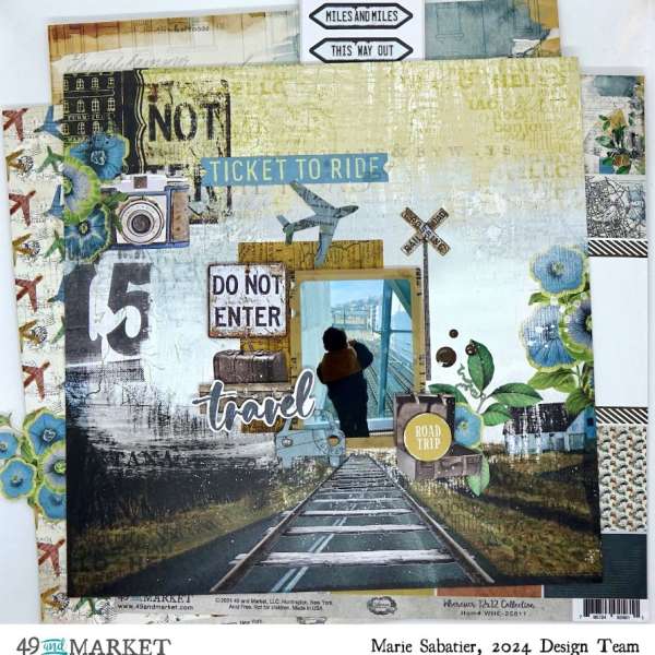
This amazing page from Marie uses a printed paper that does most of the work for you to create a very detailed background, to this she added acetate and chipboard elements and laser die cut images too. Take a closer look at the 49th and Market blog.
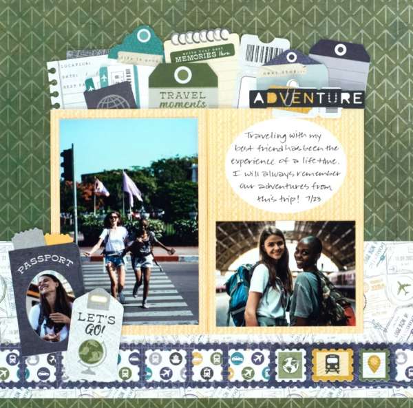
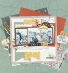
This travel layout has a borders of faux tickets across the bottom created with punches and tons of fun tags tucked behind the photos. With all this detail there’s still room for 3 photos and journaling. Learn more at the Creative Memories blog.
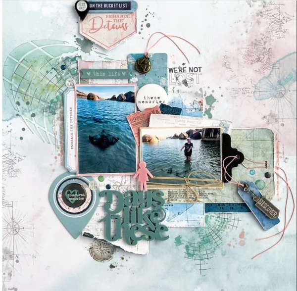
This monochromatic grey/green layout is perfect for photos on the water. This travel page from Julie uses map pattern paper, gems, buttons, tags, twine and thick acrylic shapes and title for loads of depth and texture. Take a closer peek at the Bramble Fox blog.
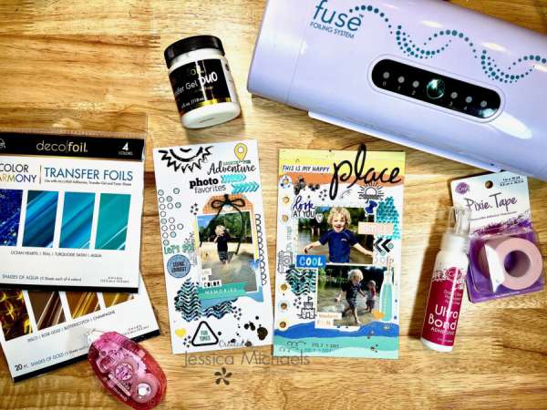
These two fun Traveler’s Notebook pages from Jessica have stitched colorful papers, splatters, stenciling, stamping and lots of foiling for shimmer and shine. You can watch her process video over on the Therm O Web blog.
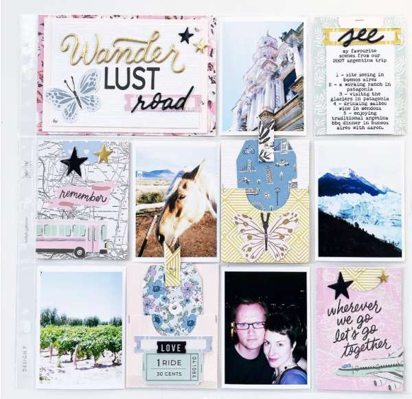
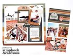
If you’ve got lots of photos to fit on one page pocket pages are the way to go. Slip in pictures, and decorated journaling cards into each pocket for a quick and easy design. I spotted this travel pocket page on Jess Forster’s Instagram page.
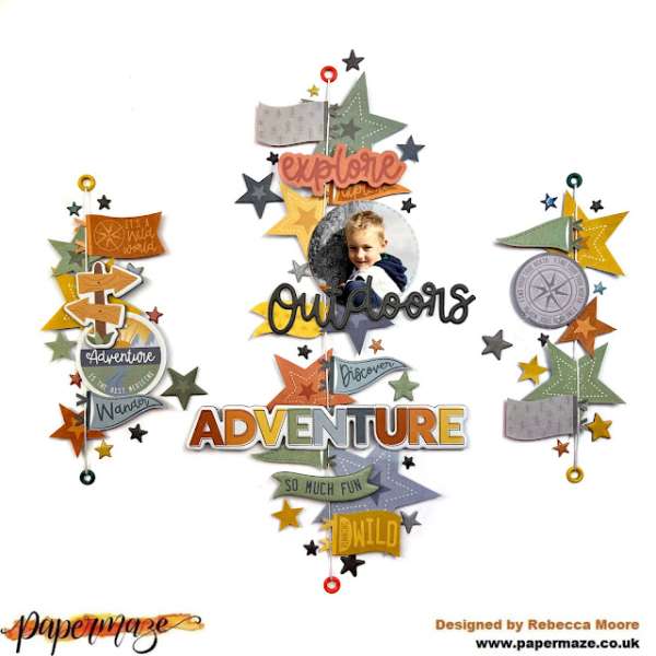
This outdoor adventure page has three amazing vertical rows over a white background. Each is made up of thread strung between eyelets and decorated with fussy cut flags and stars, puffy stickers and chipboard sentiments. Rebecca shares how she put it together on the Scrap Paper Scissors blog.
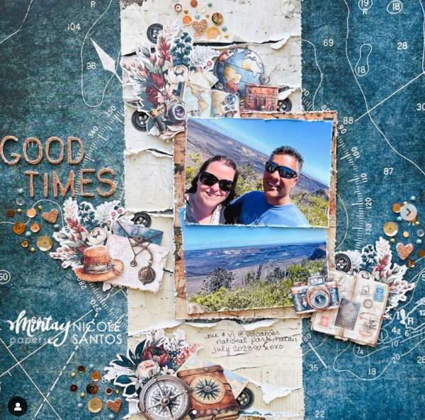
Nicole used the brand new Traveler collection from Mintay for her layout. The background is blue map pattern paper with torn cream papers in a border down the center which makes me think of an old pirate’s treasure map. She’s also added lots of clusters of printed die cuts and a dimensional title. I came across this idea on the Mintay Papers Instagram page.
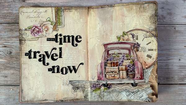
And lastly let’s take a look at a double page from Vicky’s art journal. She created an amazing background with paint, stamping, paint splatter and stencil paste, adding torn and fussy cut papers to two corners with more embellishments over top. She used a black pen to trace around some of the elements and added a black die cut title. Watch her video tutorial on the Clips N Cuts blog.
I hope you’ve had a chance to get out of the house and do a bit of traveling this Spring!
-Heather
You can shop some of our affiliate companies mentioned in this post:

Leave a Reply