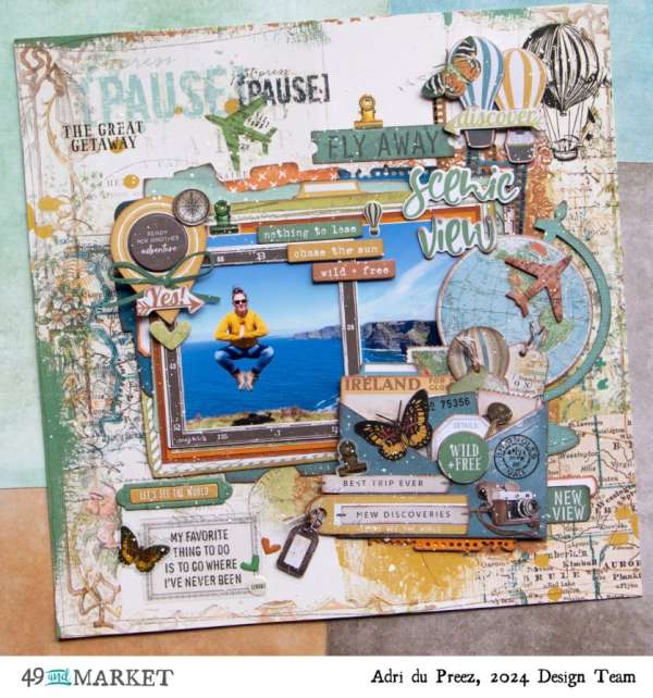
Adri used lots of travel related items for this dynamic page. There’s map paper, a globe, hot air balloons, compass, planes and lots more. There’s also loads of dimension from chipboard, washi tape, rub-ons, stickers and ephemera. Learn more at the 49th and Market blog.
It’s time to hit the road and take a trip this summer, head out in the car on a day trip, hop a plane and go some place far away or explore your own city. No matter where you go or what you do be sure to snap lots of pictures along the way and when you arrive home create some great Summer Travel scrapbook layouts to capture all those amazing memories. Let’s take a look at some wonderful new page ideas to get you inspired. Also look for a free cut file download along the way!
Beneath each photo you’ll see a link, click it for more details like products used, tips and techniques.
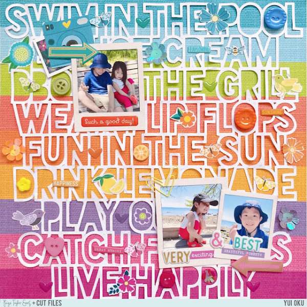
This colorful page from Yui has a bright 9 striped pattern paper background with a large cut file of summer words in 9 rows that match perfectly. Notice how she filled in some gaps with small buttons and stickers that match their stripes color. Find all the details on the Paige Taylor Evans blog.
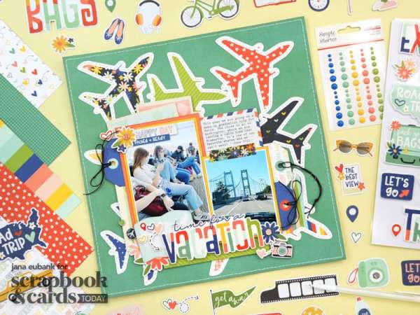
Jana also used a large cut file to fill the background of her travel layout, this time it’s airplanes. Over top she layered her photos, several tags, pattern paper and some typed journaling on an air mail card. She added extra texture by stitching around the planes too. Get this FREE cut file yourself and learn more about her layout on the Scrapbook and Cards Today blog.
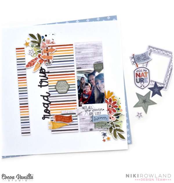
Niki separated her round trip layout into tall vertical sections with stripped and woodgrain papers. Along the white space she added the die cut title vertically also and added chipboard shapes like signs, banners and leaves. Drive on over to the Coca Vanilla blog for all the details.
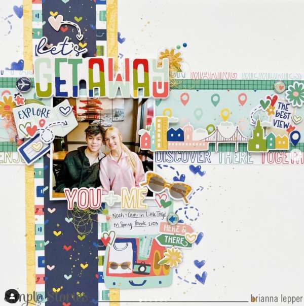
Brianna created a + sign up and to the left on her travel layout made of different strips of pattern paper. In the center she added her photo surrounded by travel themed chipboard and puffy sticker images and words. I came across her design on the brilepper Instagram page.
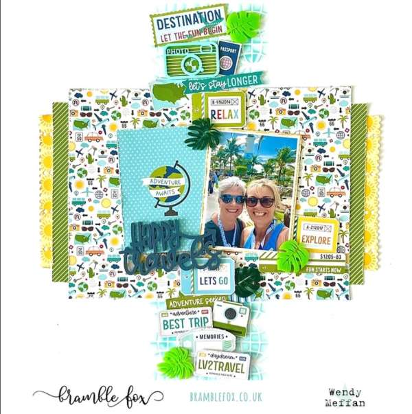
Wendy stenciled globes in blue down the center of her travel layout, added layers of pattern papers, the photo, a globe journaling card and acrylic title in the middle. Following the same line as the stenciling she added a row of embellishments like license plates, cameras, signs and acrylic leaves. Learn all about it on the Bramble Fox blog.
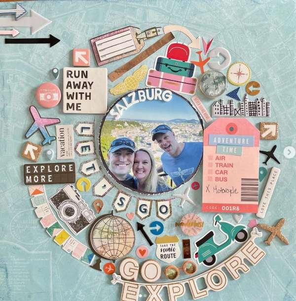
There’s no shortage of embellishments on this fun layout, this is a great way to use up items you’re “hoarding”! The round photo in the center is on travel paper with a large ring around it filled with stickers, buttons, chipboard and acetate shapes. I spotted this idea on the Dragonfly Dreams Instagram page.
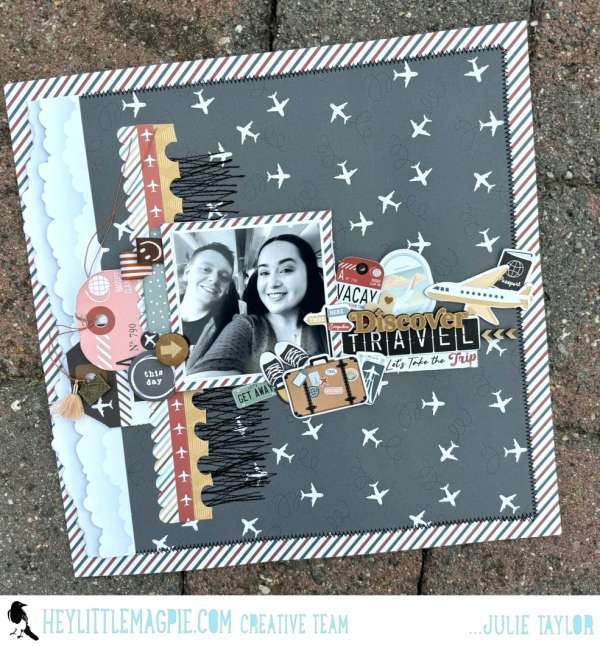
Julie kept more of her embellishing on the left side of the page with a shaped edge paper borders like cloud, scalloped and notebook, a couple of tags peeking out and random stitching in black. Her photo takes center stage with a row of more embellishments and the title coming out across the center. Fly on over to the Hey, Little Magpie blog for more on this layout made with Echo Park Paper supplies.
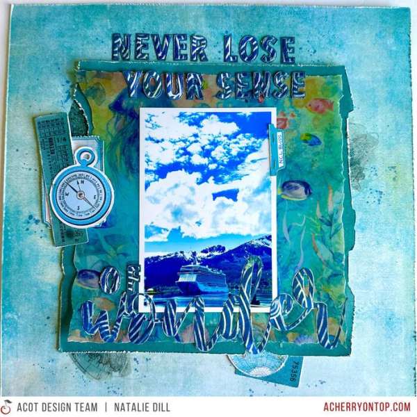
I love the monochromatic blue color scheme on this beautiful travel layout from Natalie! The underwater vellum paper and clear stickers had a subtle depth and the wavy paper for the die cut title adds movement. Find a link to her process video on The Cherry on Top blog.
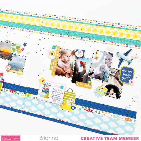
Don’t forget to take photos during traveling like on the plane. These darling baby on the plane photos have slim striped borders behind in a jagged row all across the double page spread. There’s also wide borders top and bottom from layers of pattern paper with cute embellishments scattered around. Learn more about Brianna’s pages on the Bella Blvd. blog.
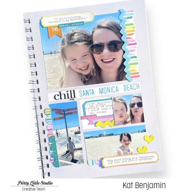
If you want to use several photos on a layout keep it simple like this 8 1/2″ x 11″ layout from Kat that has 4 photos. She added scalloped and rick-rack trims, a few hearts and typed labels for journaling. Take a closer peek at the Pretty Little Studio blog.
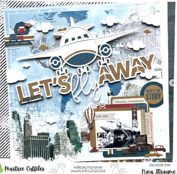
Nina used a cool cut file from Peartree that has a large plane and the title that fills the top half of her design. The background has travel paper and she added the photo in black and white on layers of rounded tags, papers and labels with cars, suitcases and hot air balloons for a fun vintage feel. I spotted her page on the ninascrapbooking Instagram page.
I hope you’re able to get away this summer, even if only for a day and have some fun taking a trip and creating some terrific travel layouts when you return!
-Heather
Shop some of our affiliate companies mentioned in this post:

Leave a Reply