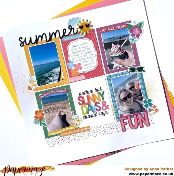
Anna used a grid style for her Summer Fun layout with die cut title, punched lacy border, hand journaling and bold journaling card. Notice how she tucked little embellishments and sentiments around each grid section too. I spotted this page on the Papermaze_UK Instagram page.
Autumn is almost upon us so let’s have one more big hurray for Summer and make a push to finish off all those Summer layouts with some last minute page ideas. Wave goodbye to these past warmer months when we vacationed and traveled, splashed in the pool, went camping or to the lake and sat in the sunshine and capture those memories with photos on some final Summertime layout designs.
Below each photo you’ll see a link, click it for all the details like process videos, products used and tips.
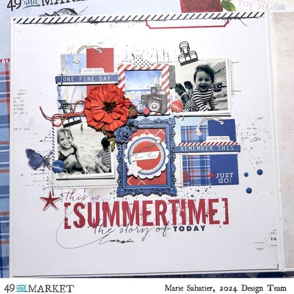
Marie used a festive red, white and blue color scheme for her Summertime layout. There are layers of squares in a lose grid design made from photos and pattern papers. She also included lots of 3D elements for dimension like flowers, twine, gems, metal frame, buttons and more. Take a closer look at the 49th and Market blog.
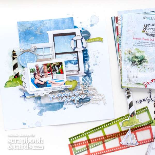
Nathalie used lots of different elements and mixed media for her Summer layout which is mostly monochromatic blues. She used chipboard, rub-ons, netting, pre-printed ocean scene paper and acetate for this wonderful mixed media layout. She breaks it all down on the Scrapbook and Cards Today blog.
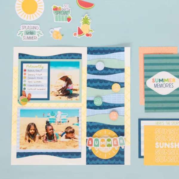
A decorative trimmer turns pattern papers into fun waves for a wide side border and photo mats. This cute beach layout is also accented with circular sentiments, a banner, sun and beach ball. Swim on over to the Creative Memories blog for more info.
Finish off Summer with an August layout like this adorable one that used a kit. There’s orange and yellow pattern paper, plaid photo mats, tabs behind each of the three photos, die cut title and a big sun cut from a circle and rectangles. Learn more at Quick Quotes.
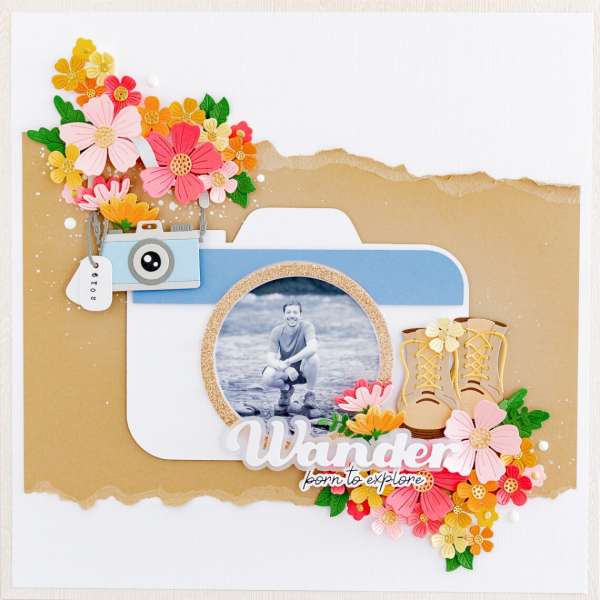
Capture a fun Summer photo with a camera die that pulls the focus right to the center. I love the hard and soft of this design from Celes with paper tearing, blues and tans and hiking boots balanced with pretty die cut flowers. Find all the details at the Spellbinders blog.
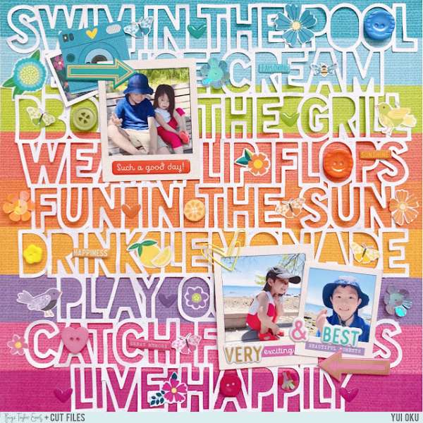
The background of this sweet page is filled with all the fun phrases of summer. Notice how Yui lined up each one with the colorful stripes of the background paper. She also added little embellishments all around and made the photos appear as Polaroids. Find all the details on the Paige Taylor Evans blog.
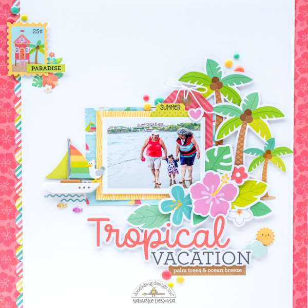
The white background helps all the tropical colors of this vacation layout really pop! Nathalie kept most of the “action” in the center with the photo surrounded by clusters of palm trees, hibiscus flowers, a sailboat and the title. She added this side borders and another small cluster at the top to help pull the colors out even more. Find more info at the Doodlebug blog.
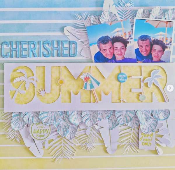
I love the soft blues and yellows on this sweet Summer design! Notice the negative “summer” word die cut, it’s a great way to use both positive and negative die cut letters for two different layouts. There’s also a lots of texture from all the leaves hanging below the title too, some are die cut and some are fussy cut from pattern paper. I spotted this idea on the scrapbook_tales Instagram page.
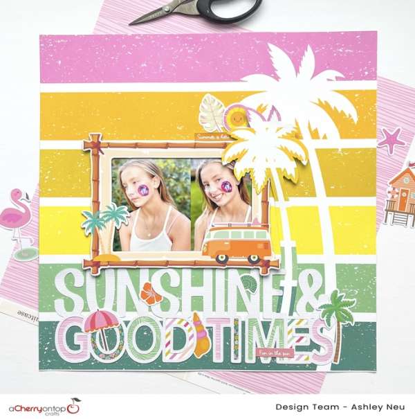
Here’s another terrific stripey Summer layout that lets the pattern paper shine. Ashley added two photos in a fun bamboo frame with a die cut title, part of which is backed with different pattern papers. There’s also several palm trees to emphasize the tropical feel. Learn more at The Cherry on Top blog.
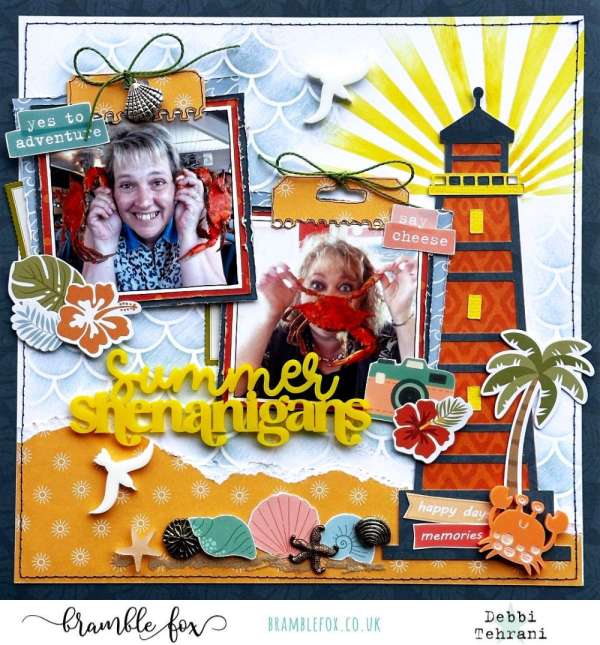
Debbi used a light house die cut file on one side of her silly Summer layout, creating a beach scene with torn blue and orange papers. There’s also loads of dimension of chipboard elements, an acrylic title and crab and several metal charms. Take a closer look at the Bramble Fox blog.
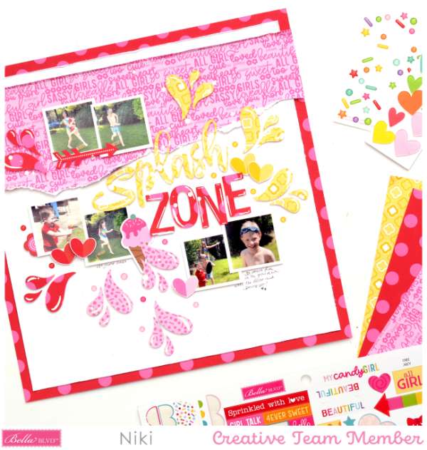
Bid farewell to Summer with one more afternoon playing in the sprinklers. This bright layout from Niki used die cuts for the title and water splashes in bold pinks, reds and yellow. For texture there’s also torn pattern paper, stitching and shine marks drawn with white pen. Watch her process video on the Bella Blvd. blog.
I hope you’ve found some ideas and inspiration to finish up your Summertime layouts before Fall arrives!
-Heather
You can shop some of our affiliate companies mentioned in this post:

Leave a Reply